I was asked to design some banners for the employees at DonorPerfect to use in their LinkedIn profiles. It was a fairly open ended assignment where I was allowed to flex my creativity a bit, so I had a lot of fun working on it. The reception across the company was very positive and some people even shared screenshots of their profiles with the new banners! Mission accomplished!!
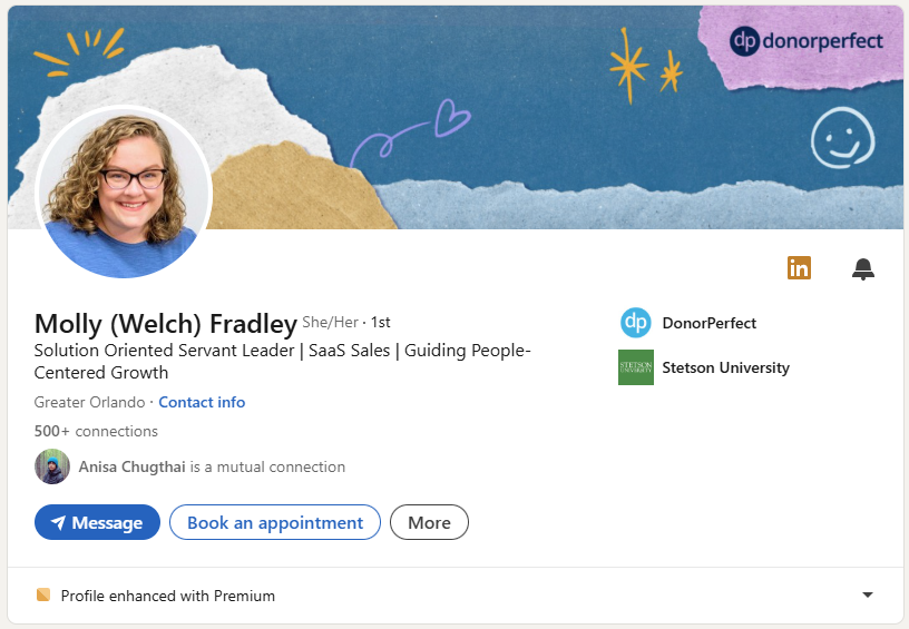
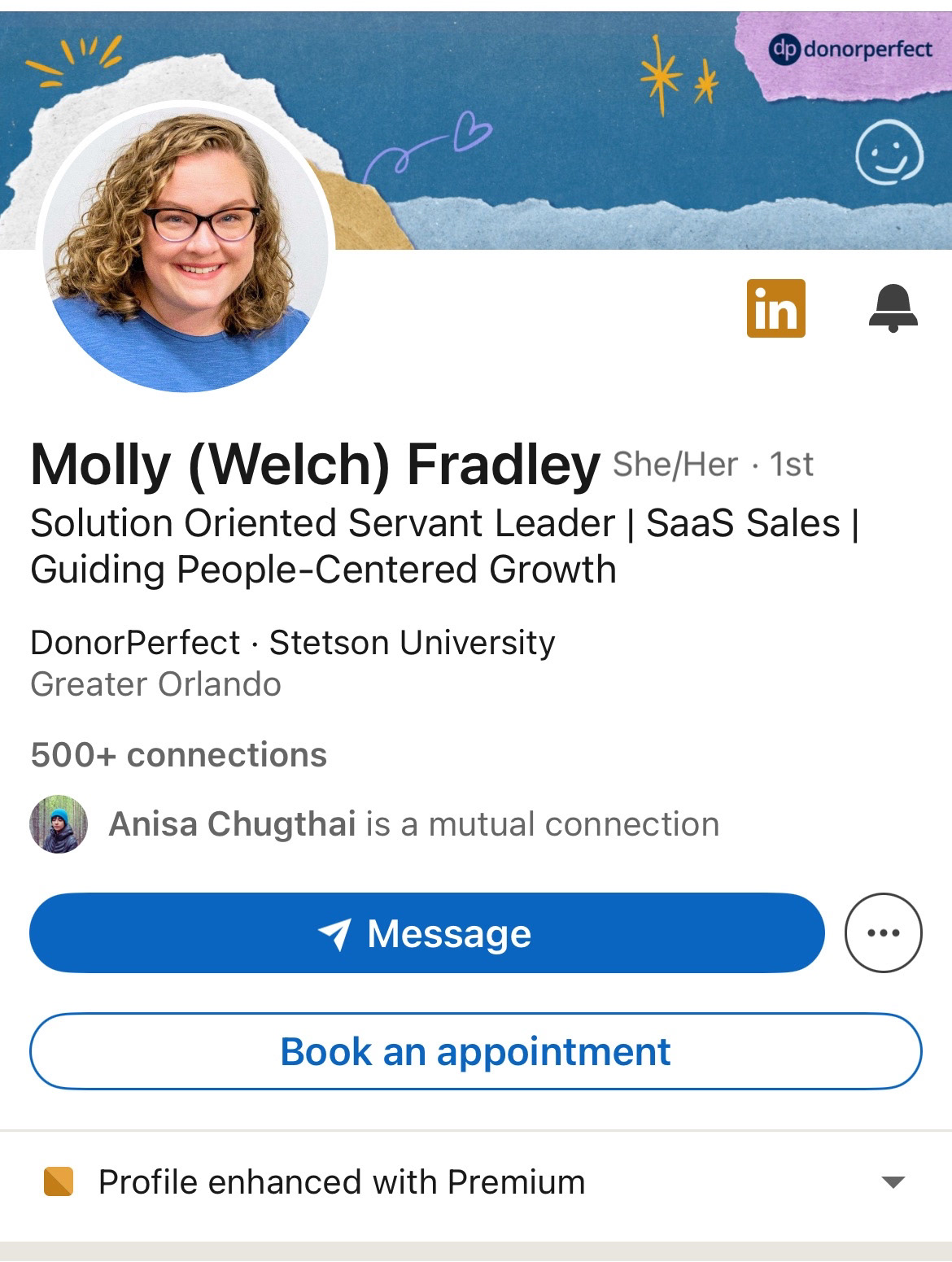
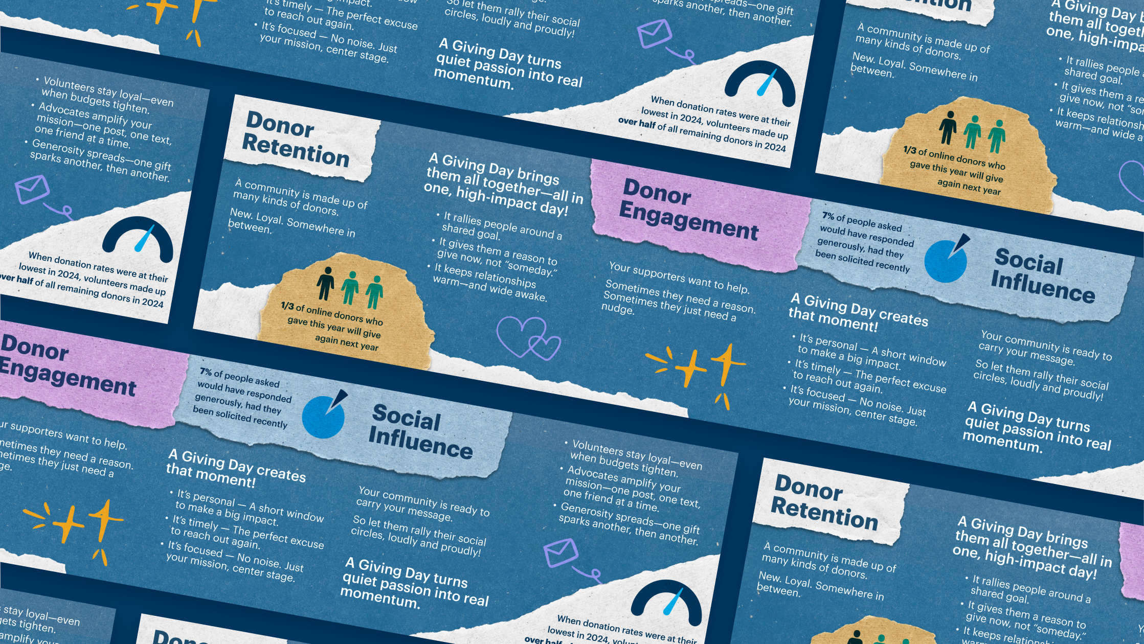
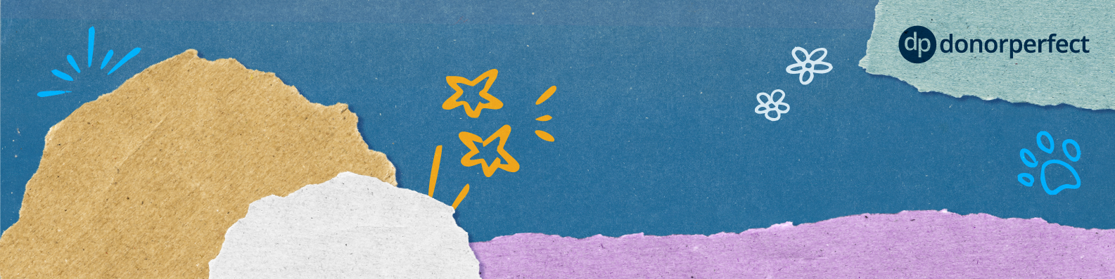
These first two designs were made with reused assets from a "Giving Days" ebook that one of my co-workers previously designed. The scrapbook-y elements and doodles lent themselves well to a more playful and energetic design than the standard DonorPerfect branding typically allows. I was able to use LinkedIn's guidelines for banners to create a template showing where the profile pictures would appear on desktop and mobile. This made placing the two circular cuts of paper to frame the user much easier.
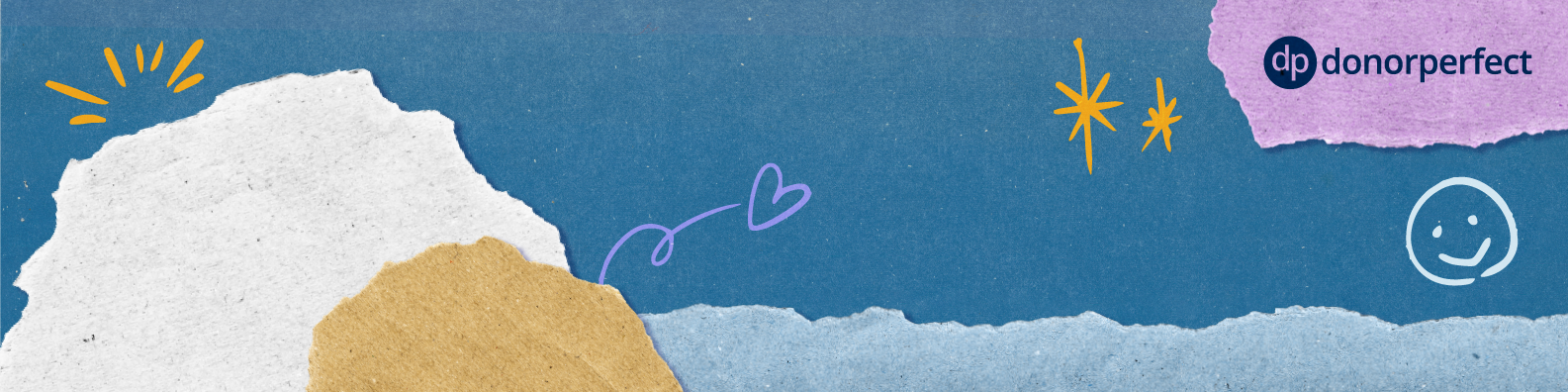
These two designs are based on DonorPerfect's standard branding. Due to the simplicity of the brand style, the composition was the key to the success of the design.
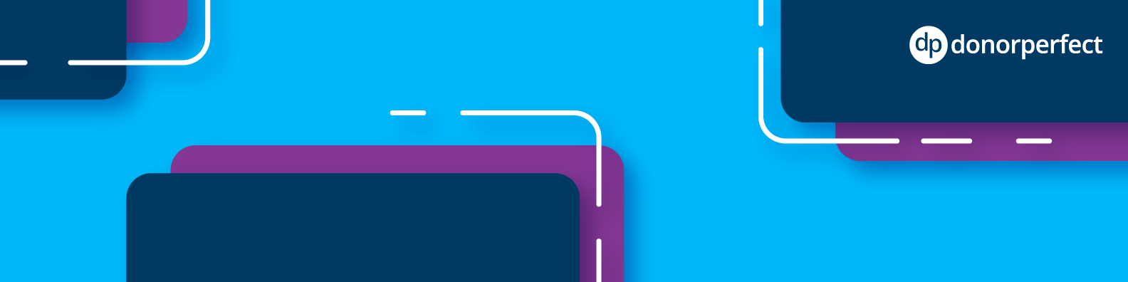
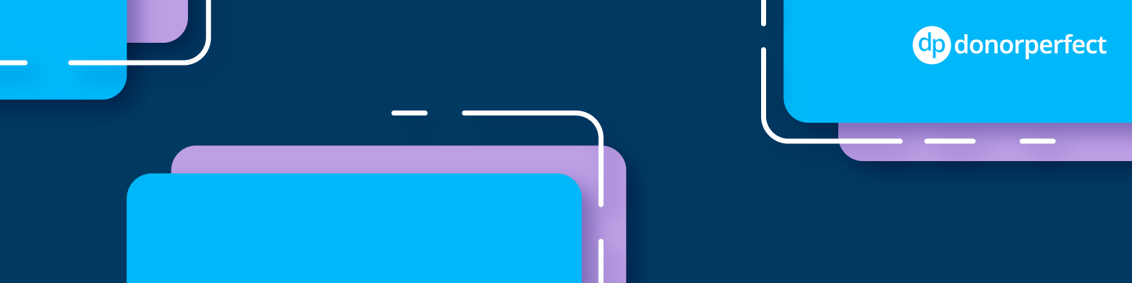
Below you'll see what the banner's look like when used on desktop (left) and on mobile (right). In both instances the avatar is satisfyingly framed by the rounded pieces of paper thanks to the use of my template.