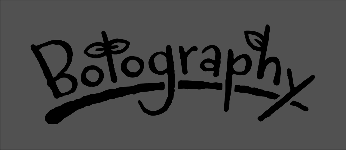
I created this logo for the game I developed for my senior capstone project. I wanted to incorporate the "hand-drawn" art style of the game and make the design feel cute and light, so I used the font "Carrotflower" from Adobe fonts as a base. I love the quirkiness of the fonts proportions, especially the pronounced upper bowl of the B. Though I did make some modifications such as extending the descenders on the 'g', 'p', and 'y', and lengthening the stem of the 't' so that the leaves would have some more room.
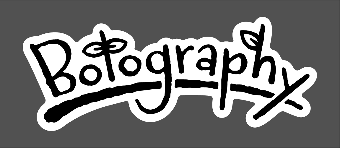
In good practice I of course also created several color variants for use in a variety of contexts. For the white version of the logo I used some tricks in illustrator to make everything just a tiny bit skinnier to compensate for the subtle bloating effect that white has on dark backgrounds.
