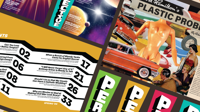
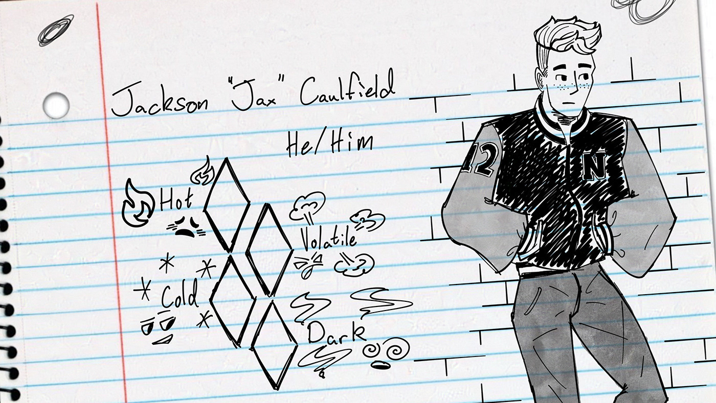
This is a sampling of the pages from a tablet set-up guide I created while I was on Co-op with SEPTA. This document was made for internal use within the company to help employees with their tech. Accessibility for older employees was a concern in creating this document so I was asked to make the screenshots within the guide as large as I reasonably could to ensure legibility.
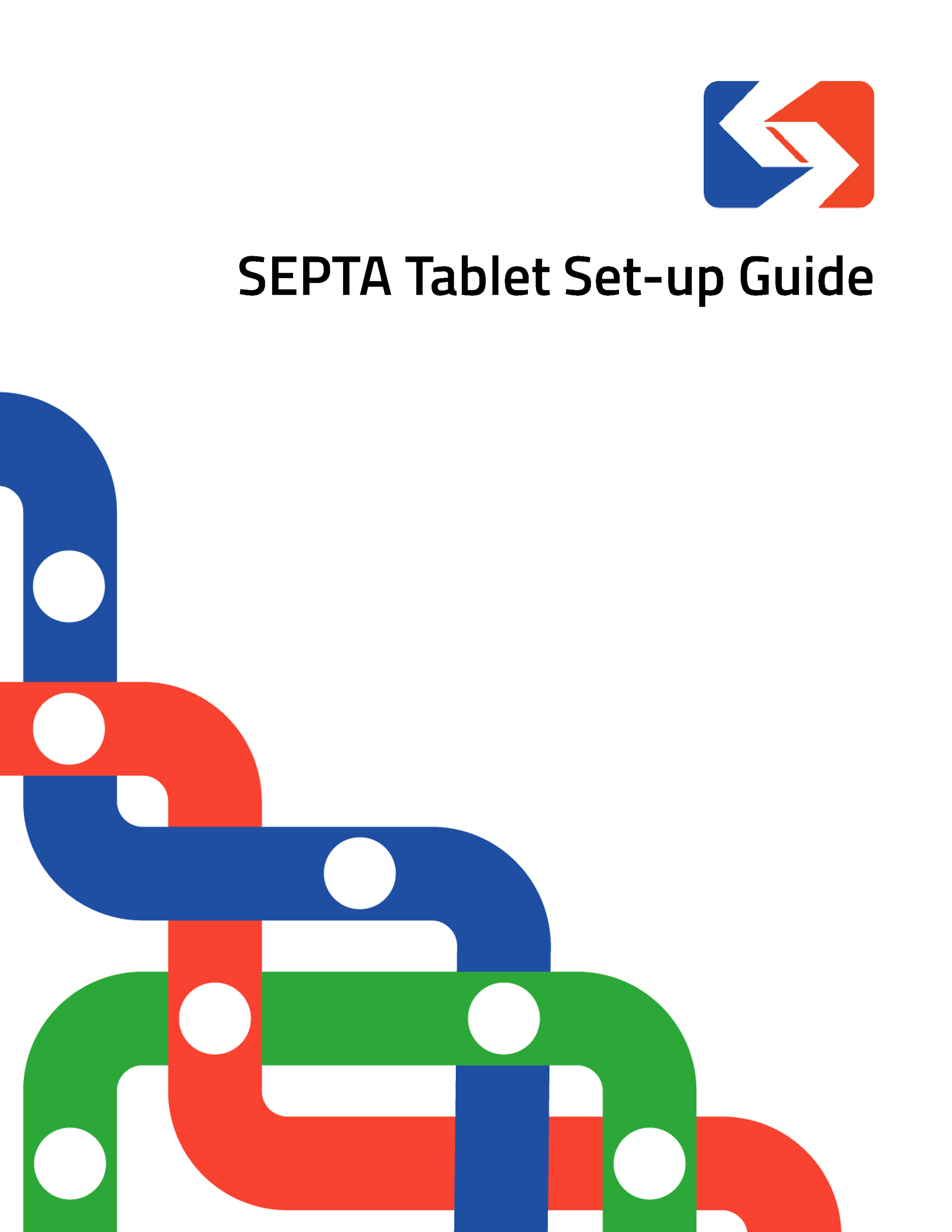
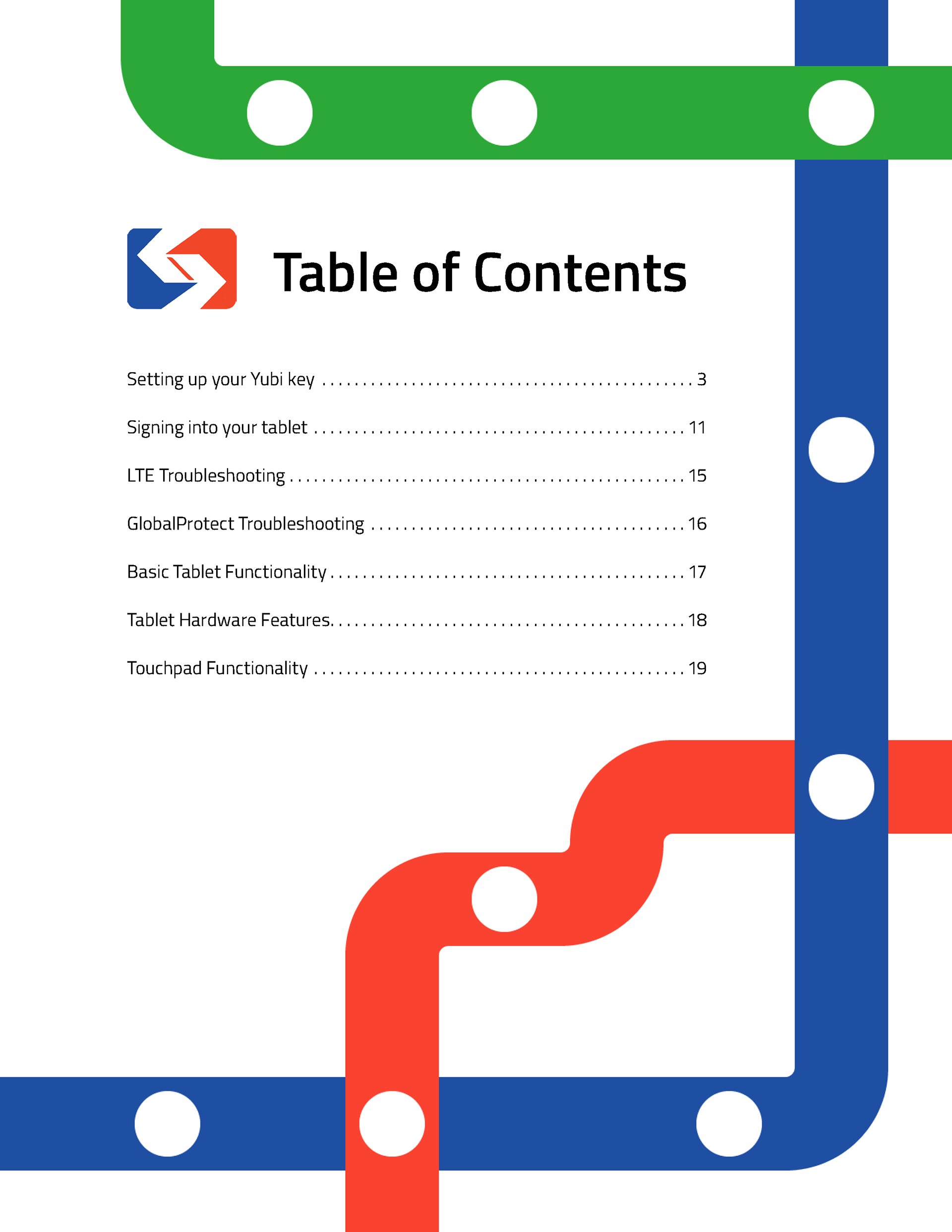
The overall aesthetic of the document was inspired by subway maps. I used the intertwine tool in illustrator to create the weaving effect quickly and easily.
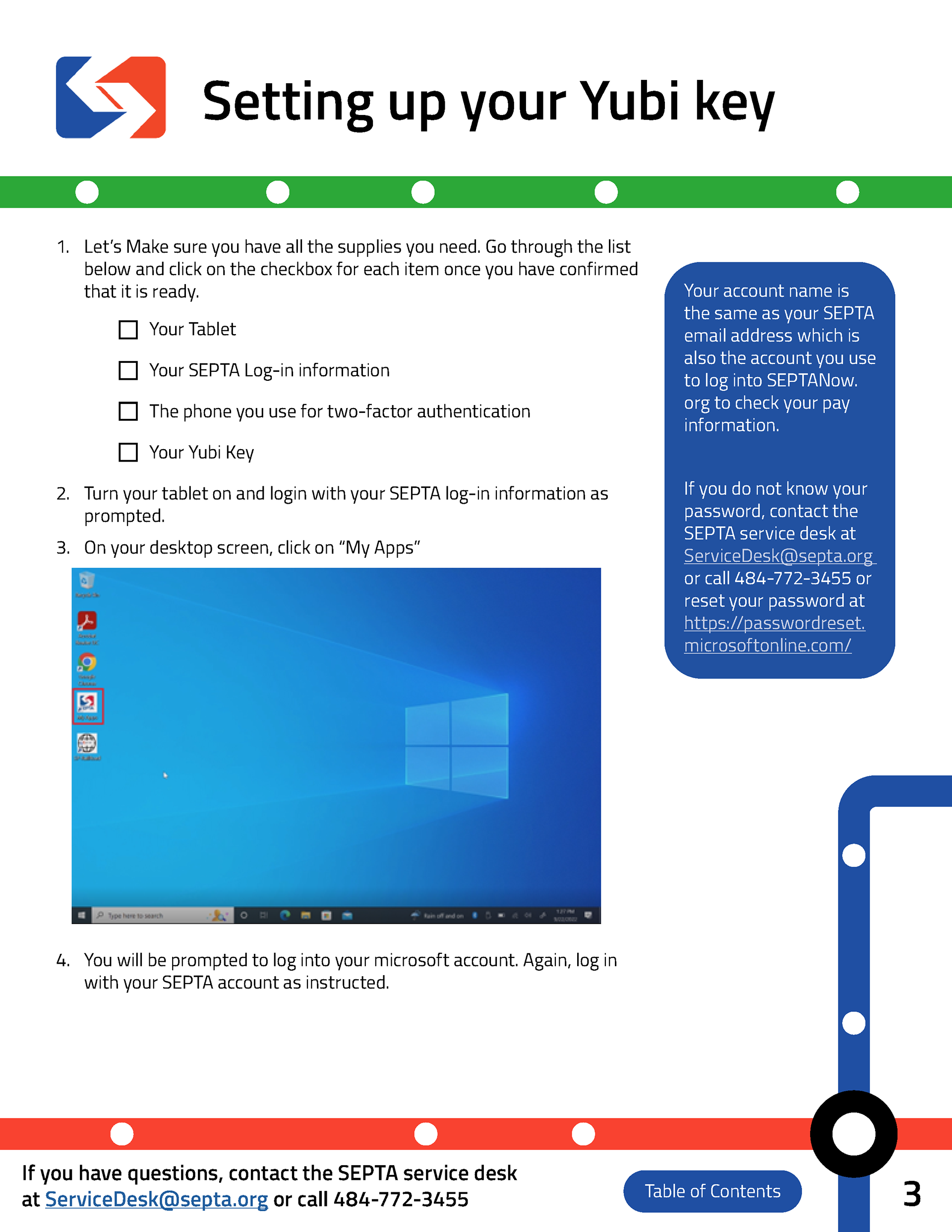
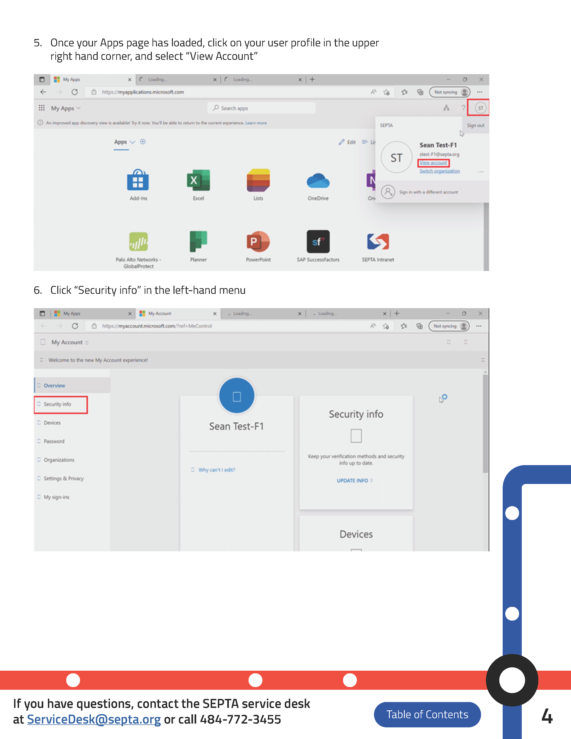
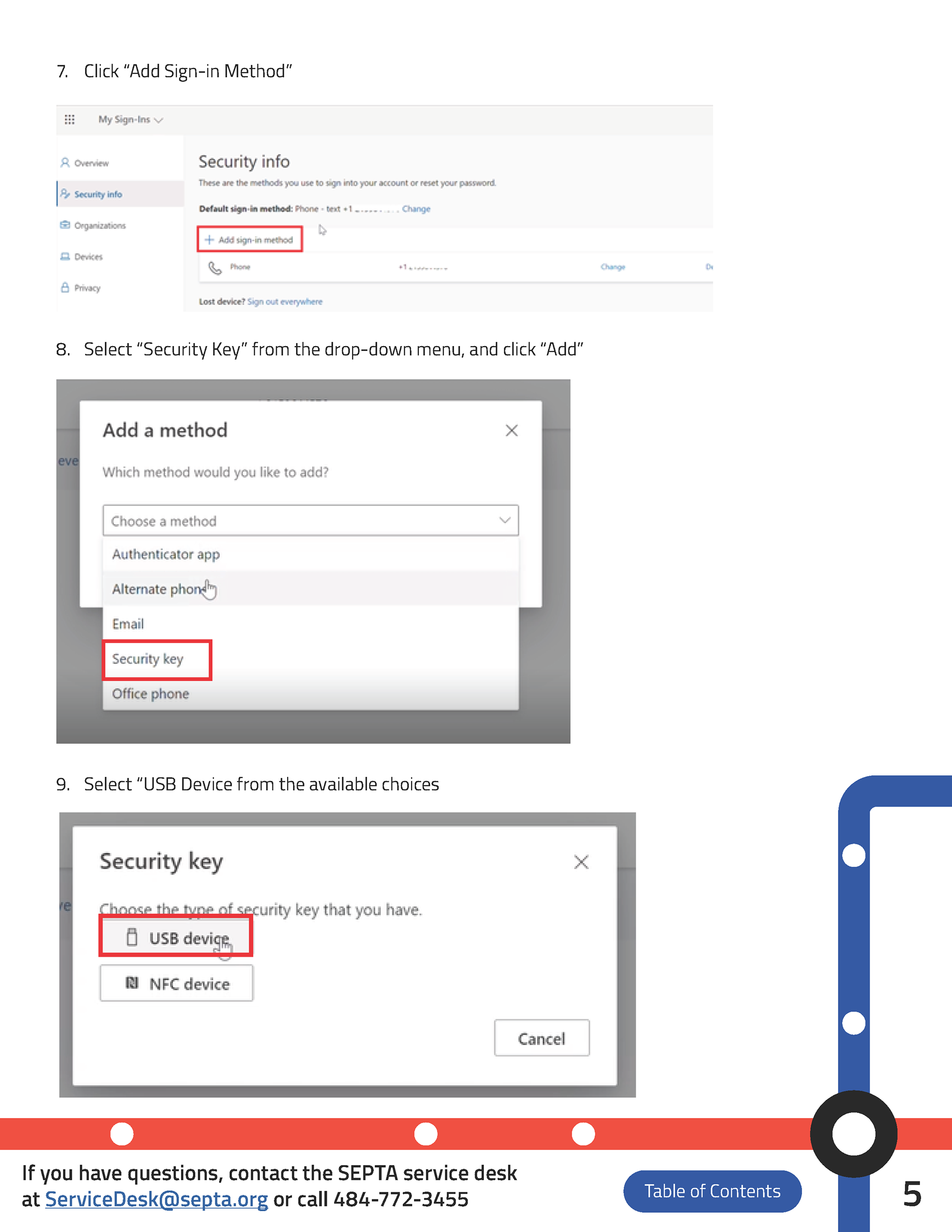
Because the PDF was made for digital use, the PDF is fully interactive. You can click on any section of the table of contents to navigate to that page and click on the button in the bottom right of each page to easily return back there as well.
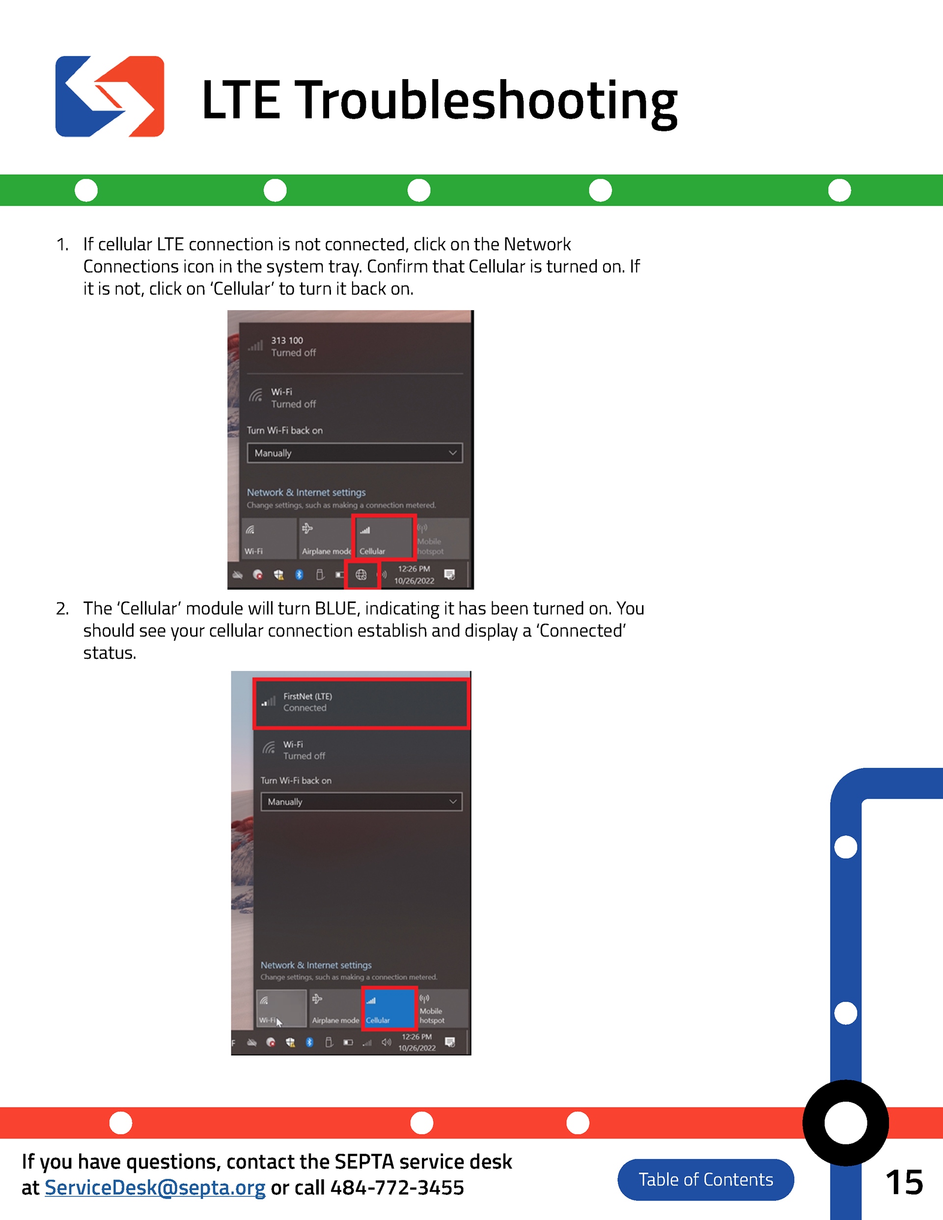
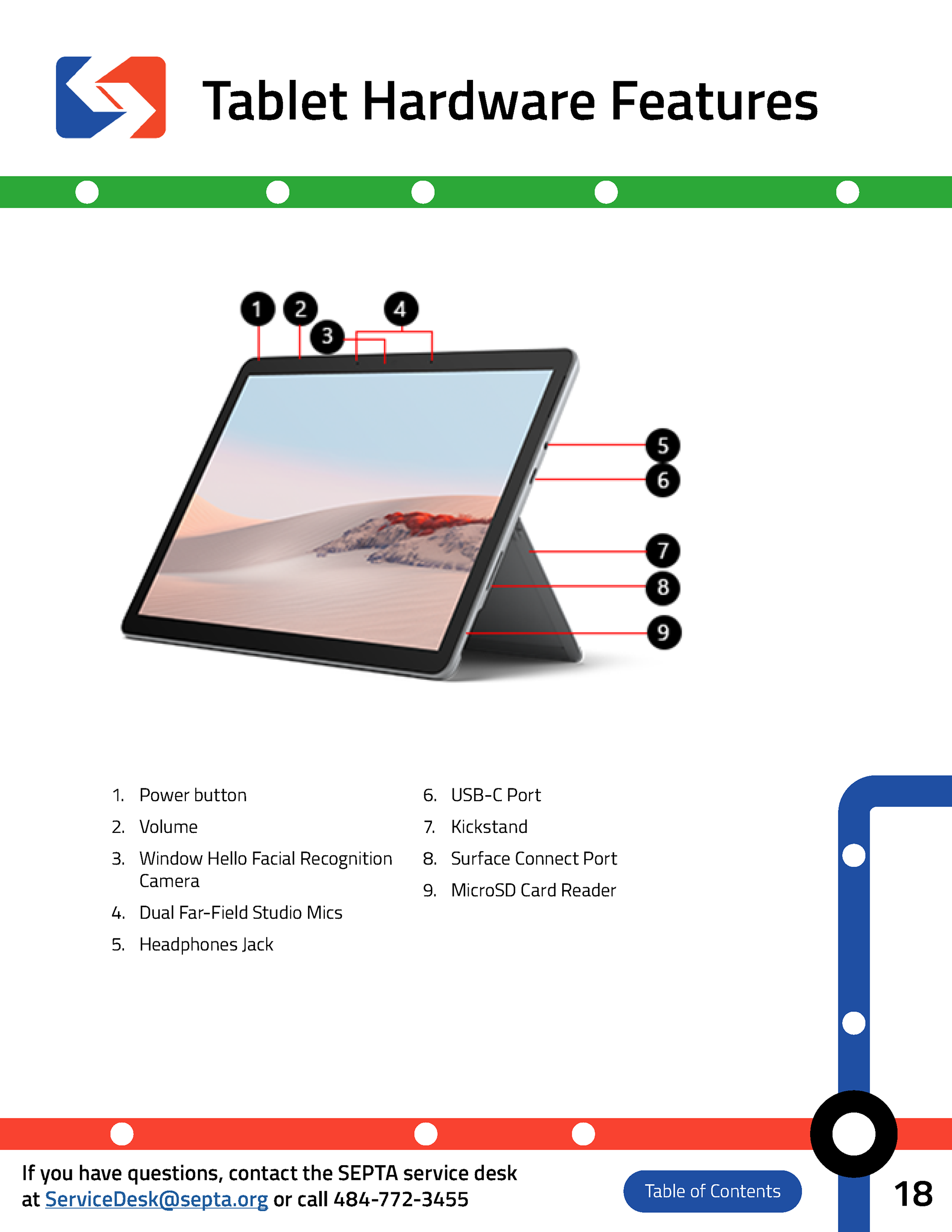
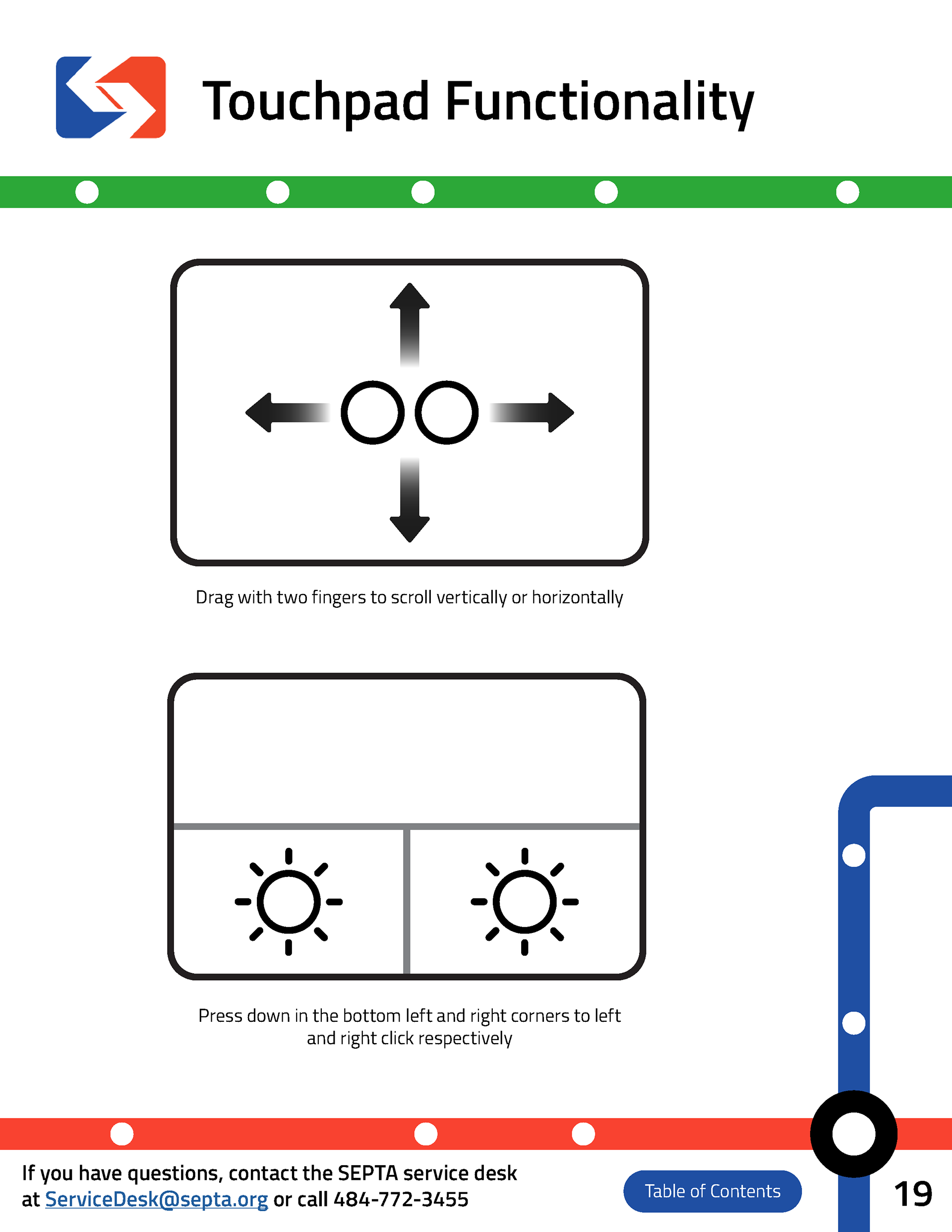
Because the document was targeted particularly towards older employees who are less familiar with technology, it was important to include some troubleshooting and reference sections in the end of the PDF. I did not create the diagram of the different parts of the tablet but I did design the visual aids for the touchpad functionality.
