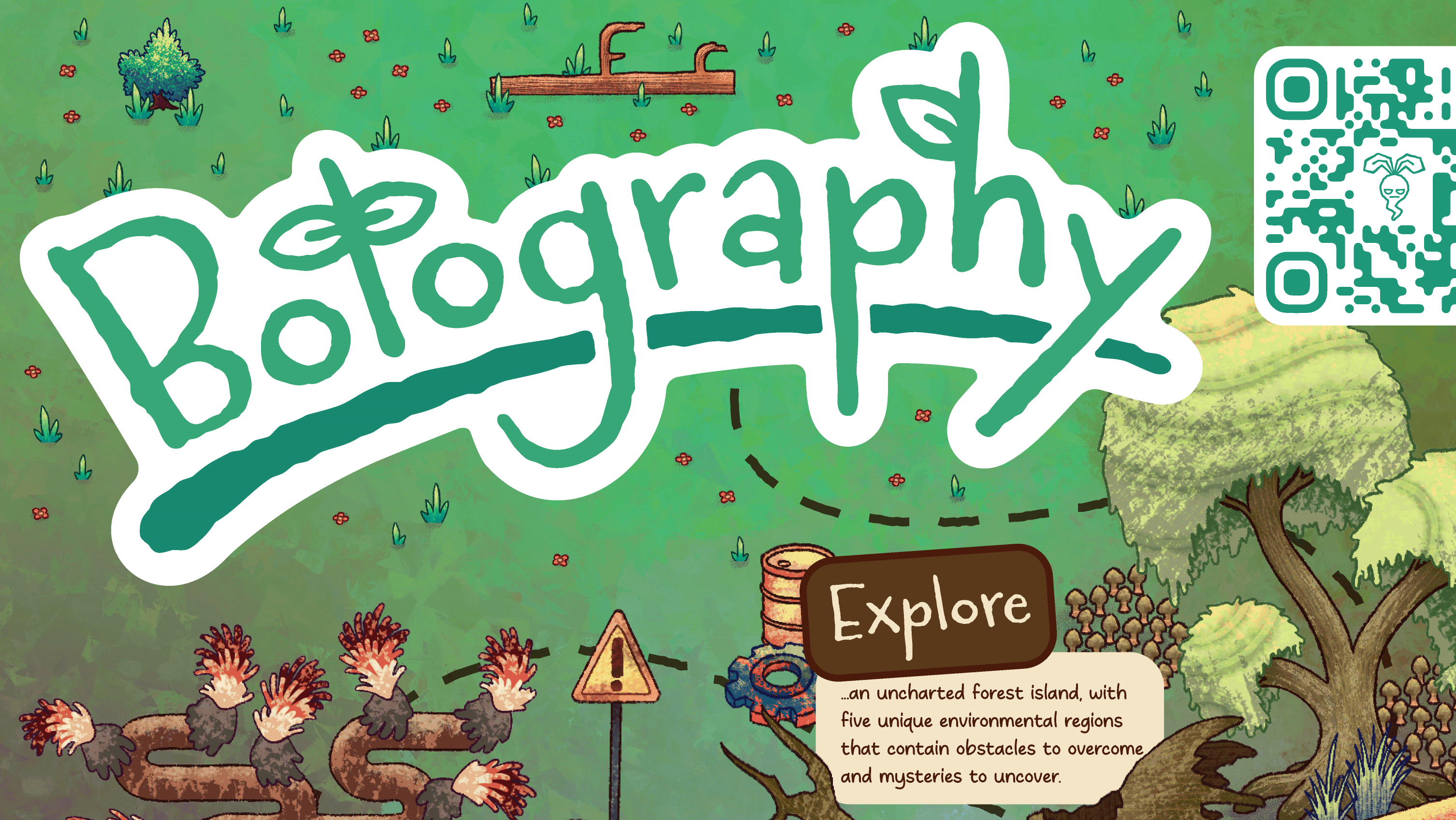
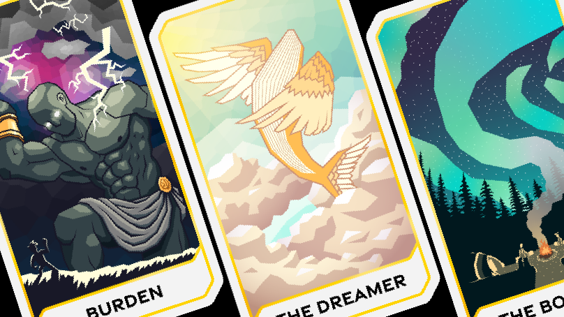
This Logo was designed for my senior project team, Project Bitter Root. I wanted it to feel playful and colorful, just like the game we are making, and I enjoyed the summer camp/scout badge vibes. I wanted to keep the logo feeling connected to the main logo for our game, Botography, but not matching. To accomplish this, I used the roughen tool to mess with everything but the font to give it that hand-made quality.
Of course, with any logo design, you need to have alternative versions, which are shown below.
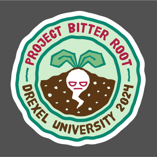
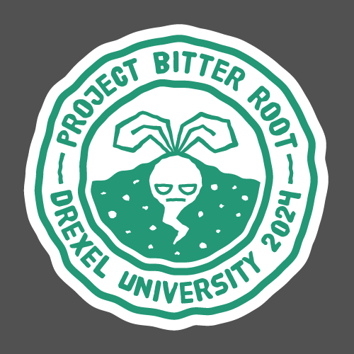
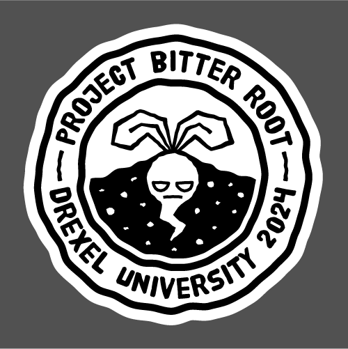
Bordered primary logo in full color, single color, and black
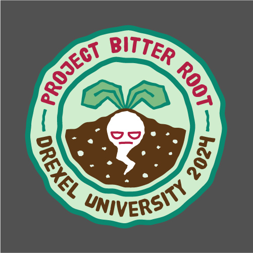
Non-bordered primary logo in full color, single color, black, and white
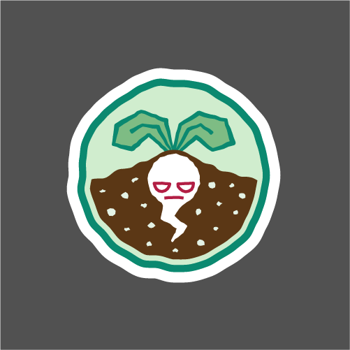
Bordered submark in full color, single color, and black

Non-bordered submark in full color, single color, black, and white
Favicon in full color, single color, black, and white with filled and non-filled variants
