I was randomly assigned the word "Perspective" for this project to design a magazine around. I turned it into a quarterly culture magazine focusing on fresh takes on society communicated with creative visuals. This magazine is for those who appreciate editorial design and are willing to invest more to see it at a higher caliber than is typically allowed by the fast news cycle we live in.
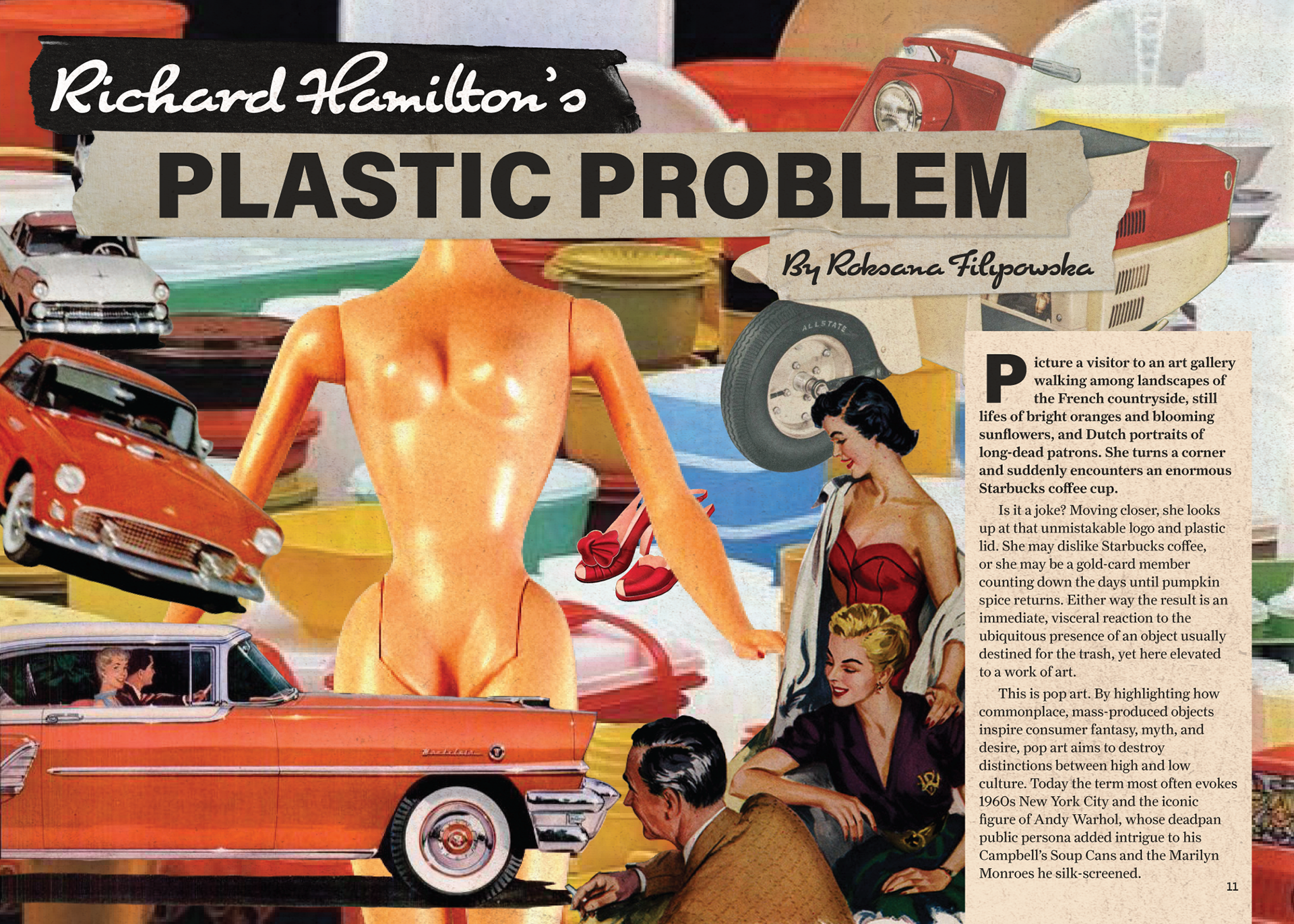
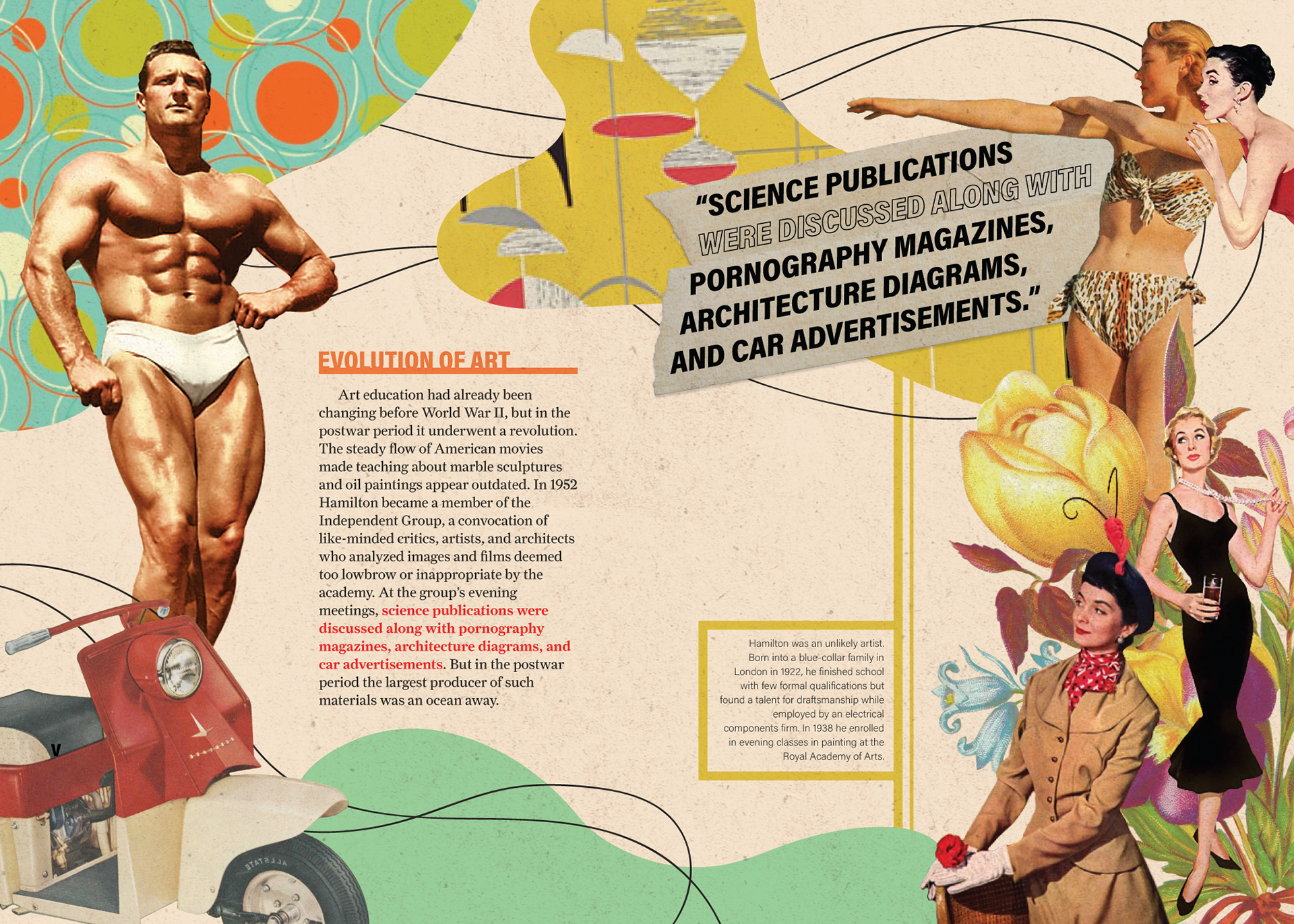
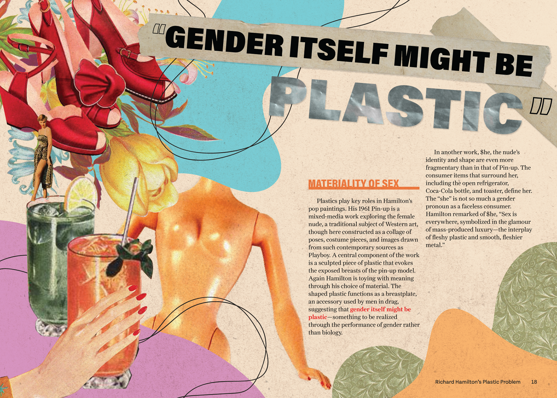
Sample article "Richard Hamilton's Plastic Problem," by Roksana Filipowska, with collaged found imagery
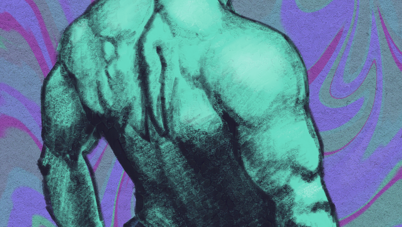
I was inspired by the description of the assorted mix of inspirations that Richard Hamilton pulled from. I wanted the article to look like we are entering the world of his collages. The women admiring the bodybuilder in the second spread reference the tongue-in-cheek humor in his 1956 piece, "Just what is it that makes today’s homes so different, so appealing?" The naked Barbie doll is an allusion to his use of plastic to form the breasts of a woman in his 1961 Pin-up.
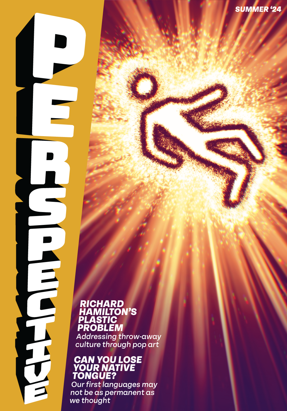
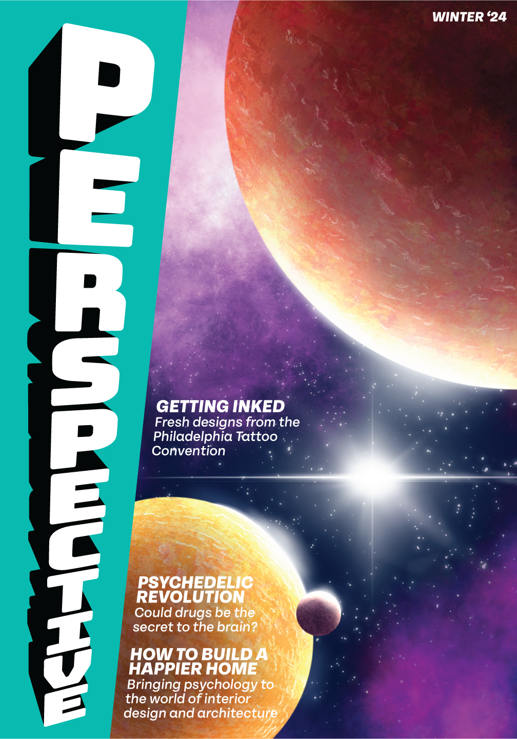
Mockups for cover designs showcasing seasonal masthead colors. Illustrations used are original
Using Illustrator's 3D tools, I made the styling of the type a play on words with the magazine's name. Keeping the Type pure black and white allows it to easily translate to the different seasonal colors, maintaining contrast and legibility. Embracing the angle created by the 3D effect, I italicized the rest of the type and aligned it to the side of the masthead, setting it apart from traditional magazine design conventions.
Seasonal Mastheads from left to right: Spring, Summer, Fall, Winter
Perspective magazine is meant to represent creativity at its most expressive. To reflect this, all the seasonal colors are bright and saturated, setting it apart from a world moving increasingly towards minimalism and the loss of color.
Mockup for table of contents with spring edition color
In continuing to play with the idea of perspective in design, I opted for this isometric block concept. Using 3-point perspective, like in the masthead, would have caused many legibility problems, so sticking to the isometric look allows the type formatting to be consistent and readable while still visually exciting.
